Set up a Link CTA
Learn how to create, configure, and place Link CTAs in your Hub.
Before you begin
- To work with Link CTAs, you must be a member of the Account Administrator, Content Manager, or Demand Generation user groups.
- This article describes how to set up Link CTAs specifically. If you want to learn about Form CTAs, see this article. If you want to learn about Uberflip CTAs generally, see this article.
Create a new Link CTA
Begin by creating your new Link CTA. Once created, a Link CTA can be styled as you choose, and can be placed in various locations around your Hub.
- Log in to Uberflip and use the Hubs menu to select the Hub you want to work with.
- In the sidebar menu on the left, click on Calls-To-Action, then click on Link Calls-To-Action:
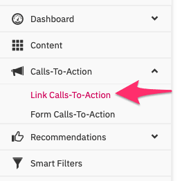
- On the Link Calls-to-Action page, click on the Build Link CTA button:

- In the Create Link CTA window, type a name for your CTA into the text field, then click the Create CTA button to finish creating the new Link CTA:
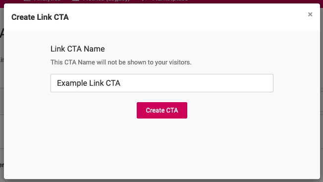
- Your newly created Link CTA will automatically open in the Link CTA Editor, where you can set up its layout, customize its appearance, and select where in your Hub you want to place it.
Set up the layout of a Link CTA
When you set up a Link CTA in the Link CTA Editor, the first section that is shown is the Layout section. You can also get here by clicking on the Layout button directly:

In this section, you can configure the basic components of your Link CTA: the tagline, the button, and the hyperlink itself.
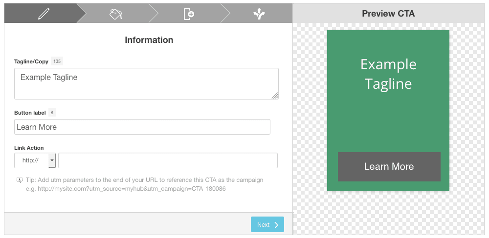
Any changes you make are saved automatically, and are shown live in the preview window on the right side.
To set up the structure of your Link CTA, follow these steps:
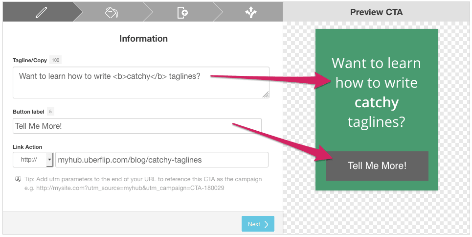
- Type a tagline into the Tagline/Copy field. This is the main copy that invites the visitor to click the link.
- Your tagline can be a maximum of 150 characters long.
- The default font size is set for taglines approx. 80-100 characters long. Longer taglines will run off the Tile (as shown in the preview), but you can adjust the font size in the Design section (see below).
- You can also use HTML tags like <b> (bold) and <i> (italics) to style your text. Add line breaks with <br> tags if you want to customize the position of the text. Keep in mind that HTML tags will count towards the character limit.
- Type the text that you want to appear on the button into the Button label field. This represents the "call" to the action you want visitors to perform.
- Your button label can be a maximum of 18 characters long.
- You can also use HTML tags like <b> (bold) and <i> (italics) to style your text.
- Under Link Action, use the dropdown to choose the type of link you want to create (e.g. http://, mailto:, etc.), then type the link into the field. This is where visitors will be taken when they click on the button.
- When you're ready, click on Next to proceed to the Design section, where you can customize the styling (appearance) of your Link CTA.
Style a Link CTA
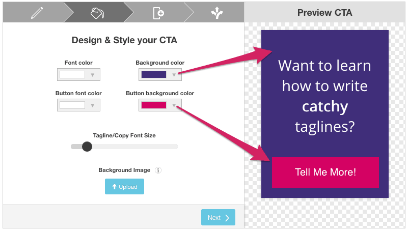
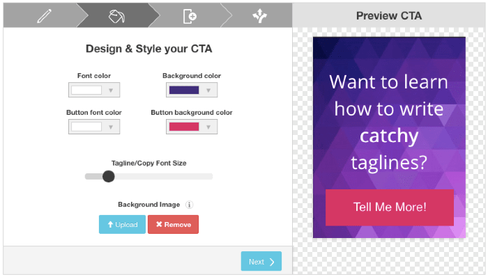
In the Design section of the Link CTA Editor, you can style your CTA by selecting colors and font size, and (optionally) setting a background image.
You can get here by clicking the Next button from the Layout section, or by clicking on the Design button directly:

Colors
You can set colors for four separate elements:
- Font color: The color of the tagline text
- Background color: The color used for the background of the CTA Tile
- Button font color: The color of the button text
- Button background color: The color of the button body
Use the dropdown for each color option to choose a color from a list of presets, using the color picker, or by entering a hex code.
Tagline Font Size
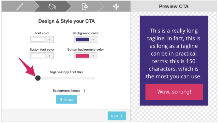
Use the Tagline/Copy Font Size slider to adjust the size of the tagline font. The text will re-flow automatically based on your selection. If your tagline is very long, your text may "slide off" the Tile (or under the button) with the default font size:
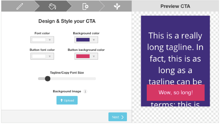
To fix this, try moving the slider to the left until all the text is visible:
Note
When the the tagline is re-flowed to adjust for different font sizes, long words will not be broken up across lines (hyphenated), so individual lines can be different lengths. Although the maximum character limit for taglines is 150, the practical limit may be lower if you use longer words, because they cannot be broken up across lines as efficiently. In other words, some very long taglines may still "slide under" the button even at the lowest font size setting.
Only the tagline font size can be changed: the button text font is a fixed size, and can't be adjusted.
Background Image
If you want, you can use a background image instead of a solid background color. Background images should be 330 pixels high by 250 pixels wide, and should be in JPEG format.
To set a background image, click on the Upload button and choose an image to use.
On the next window that appears, use the slider to adjust the crop of your background image (the white outline represents the part that will be visible within the Tile):
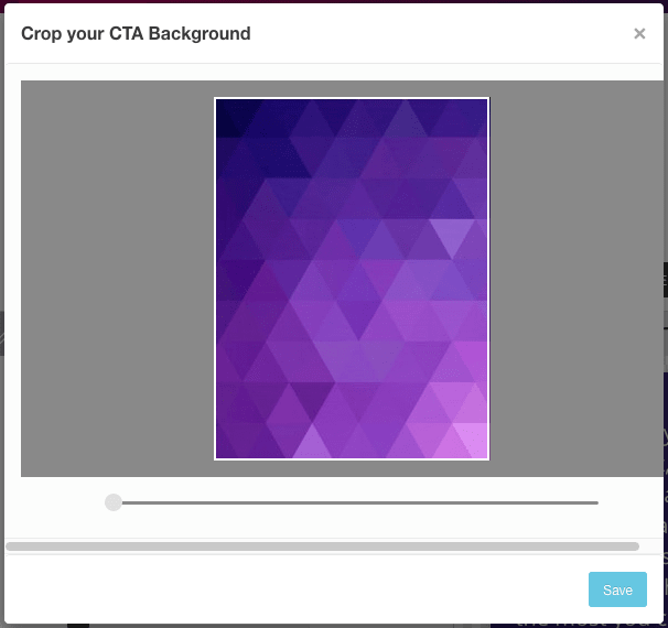
When you're finished, click on Save to apply your background image. The background image you set will override the Background color setting.
When you're ready to proceed, click on Next.
Place a Link CTA
In the Placements section of the Link CTA Editor, you can specify rules that define where in your Hub the Link CTA will be shown. You can get here by clicking the Next button from the Design section, or by clicking on the Placements button directly:

Create a placement to specify a particular Stream that the CTA will appear in, along with the location within that Stream and whether the CTA appears just once, or multiple times.
Every individual placement is specific to a Stream. You can create as many placements for a CTA as you like, but you can only create one placement per Stream.
- To add a new placement, click on the +Add New Placement button.
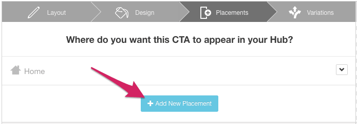
- Use the dropdown menu to select the Stream where you want to place the CTA, then click on +Add:

- You'll be returned to the Link CTA Editor, where the new placement will be shown. Here, you can choose to place the CTA At Stream Level, At Item Level, or both.
Link CTAs will be placed at Stream level by default, as indicated by the checkmark next to Will appear after Item ___:
- Use the + and - buttons to specify where the CTA will appear in relation to the other Items in the Stream. The graphic to the right shows how this placement works:

- You can also check the box next to Repeat after every if you want the CTA to appear repeatedly in the Stream. Use the + and - buttons to specify how many Items should appear between each appearance of the CTA.
By default, Link CTAs will not be displayed at Item level. If you want the Link CTA to be shown when an Item in the Stream is viewed, set At Item Level to Show Beside. The CTA Tile will then be shown in the top right corner when a visitor clicks into an Item in the Stream.![]()
If you want, you can configure a Form CTA to use both types of placement (At Stream Level and At Item Level).
To use both placement types at the same time, simply check the boxes for both types. You can also disable both types as a way of temporarily disabling that specific placement.
Keep adding placements with the +Add New Placement button as needed. If you want to delete a placement, click on the Delete button next to it:
Once you have created your Link CTA placements, you're all set: the placements will become active immediately.
Next Steps
When you have completed the basic setup of a Link CTA, there are also a number of additional actions and options available. To learn more, see the articles below: