Uberflip Pages: Optimize a page for mobile
The mobile canvas allows you to optimize your microsites made in Uberflip Pages for mobile screen sizes. This article will show you everything you need to know.
Good to know
- Mobile optimization is not available on all plans. Reach out to your Uberflip CSM if you want this feature but don’t currently have it.
- Not all page properties can be optimized for mobile. Check out the What page settings can be mobile optimized? Section to see what can be customized
- The mobile version of your page will be shown on screens that are 639px wide or less
- The mobile canvas can be used to alter the properties of page elements, but you can’t add or rearrange elements from there. Element additions and rearrangements must be done on the desktop canvas.
About mobile optimization in Pages
Mobile devices make up a major portion of how web pages are consumed today, so it’s important to ensure your pages look good on all devices.
The mobile canvas in Pages allows you to define how certain page elements look on smaller screens, without affecting the desktop version.
Not all page elements need to be optimized, so we only allow optimization for elements that are affected by screen size. For example, colors generally don’t differ for mobile, but text properties such as size and alignment often do, so those text properties can be optimized.
The next section outlines exactly which element properties can be optimized for mobile.
Note
The mobile canvas can be used to alter the properties of page elements, but you can’t add or rearrange elements from there. Elements must be added and rearranged on the desktop canvas.
What properties can be mobile optimized?
Not all page properties need to be optimized for mobile as some are universal across screen sizes (like fonts and colors). For this reason, you can’t change all page properties, just the ones that change as a screen size changes.
The following properties can be optimized for mobile wherever they appear:
- Text style (does not apply to Item tiles, Tile grids, or Form CTAs):
- Size
- Lineheight
- Alignment
- Spacing:
- Column Gap
- Row Gap
- Align element:
- Vertical
- Horizontal
- Dimensions:
- Sizing (Fit, Fill, Fix)
- Width
- Padding
Access the mobile canvas
The mobile canvas is accessed through the page builder. Here’s how to find it:
- Go to Pages from the topbar
- Find and open the page you want to optimize, or create a new page. The page builder will open to the desktop version of your page.
- In the Status Control bar, click the mobile icon
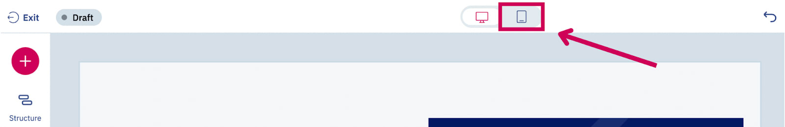
That’s it. You’ll now see the mobile canvas and can begin optimizing your page from here.
Optimize element properties for mobile
The mobile canvas works the same way as the desktop canva with a few key differences:
The mobile canvas
The mobile canvas is 390px wide, an average size for handheld devices. This view takes your Desktop page and shows what it may look like on smaller screens, giving you a chance to optimize certain page elements for smaller screens.
Note
While the mobile canvas is 390px, the mobile version of your page will be shown to visitors on screens that are 639px and below.
Changing property values for mobile
The properties panel will always show all properties for the selected element, regardless of whether you’re looking at the desktop or mobile canvas. Any property can be optimized from either canvas.
But when altering a property that can be optimized for mobile and desktop from the mobile canvas, a highlight will appear over the property when a mobile specific value is entered.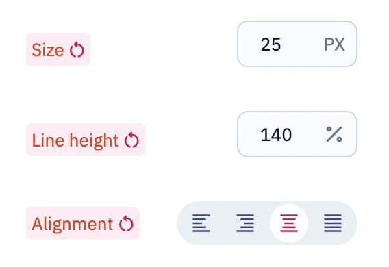
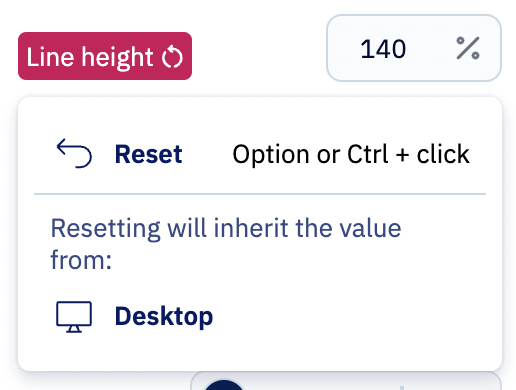
Revert the mobile value to the desktop value
Clicking the circle-with-arrow icon beside a mobile specific value allows you to reset that value back to the desktop value.