Create custom reports in Uberflip Analytics with Explore
Learn how you can use the Explore functionality in Uberflip Analytics to dive deeper into your data.
Before you begin
- Uberflip Analytics Explore is available on the Enterprise pack type, or as part of the Attribution module.
- To access Explore, your user account must hold an Uberflip Analytics Explore license. One Explore license is included with your Enterprise or Attribution module subscription. In both cases, you have the option to add more licenses if needed.
- The included Explore license is not assigned to any user account by default. To assign the license to a user account, or to add more Explore licenses, please contact your Customer Success Manager.
- If possible, we recommend assigning the Explore license to your organization's Primary User. If the license is assigned to a user account that is not the Primary User, Uberflip Support will not be able to see your Uberflip Analytics data when investigating any issues related to Explore, which may limit troubleshooting options.
- You must also be able to access Uberflip Analytics in general, which means that your user account must hold an Uberflip Analytics View license. This license is automatically assigned to all user accounts in the Account Administrator or Analyst user groups, or may also be separately assigned to an individual user account that isn't a member of those user groups.
Tip
Even if you only have an Explore license on one user account, anything that user account creates with Explore can still be viewed by any other user account which holds a View license (i.e. any Account Administrator or Analyst user).
About Uberflip Analytics Explore
Uberflip Analytics has built-in dashboards that make it easy to see how your content experiences are performing at a glance. But they're only the tip of the iceberg: behind these dashboards is a mountain of raw data, and Explore helps you to unlock its full potential by giving you direct access.
Using Explore, you can create custom reports tailored specifically to your organization's needs. This means you can go much deeper than the stock dashboards and reports, allowing you to uncover all kinds of valuable insights, and find answers to even the most hyper-specific business questions.
To give you an idea of the kinds of things you can learn, here is a sampling of actual questions that Uberflip customers have asked us, and which Explore can answer:
- Which of my content Items are getting traffic from Google and other sources/mediums each month, and how much traffic?
- I have content Items that I've added to multiple Streams. Are those Items getting more traffic in certain Streams, and if so, which ones?
- I use query string (UTM) parameters on my external links. Can I see how specific parameters are driving inbound views to my Hub?
- I want to know when progressively profiled CTAs are being filled — how many days does it take on average for a lead to be fully profiled?
- Can I see an SEO breakdown of all Items in my Hub, including whether Items that need canonical URLs actually have them?
If you're looking for answers to these or similar kinds of questions, Explore can help you find them. In this article, we'll look at the key concepts you need to know to use Explore, and will walk through the process of creating your first custom report from start to finish.
Data exploration in Uberflip Analytics: a quick primer
Getting started with a data exploration tool like Explore can be a little intimidating. Here's a quick primer to get you up to speed with everything you need to know to be successful.
You can't break anything
The first and most important thing to know is that Explore is non-destructive: even if you stop reading right here and just go play around in Explore, you won't be able to break anything. No matter what you do in Explore, you never need to worry that you might delete, corrupt, or otherwise affect your data or the stock dashboards and reports. As a result, you should feel free to experiment with Explore: there's practically no risk, so just try things and see what happens. The best way to learn is to get hands-on, and you can always just wipe the slate clean and start over at any time.
Basic terminology and concepts
Uberflip Analytics is at its core a database, and Explore is a tool for pulling data from that database, in order to create custom reports.
More specifically, Explore is a query builder: it helps you to create queries, which are essentially requests to the database that tell it exactly what data you want, how to combine that data, and how to present it to you. Whenever you submit a query to the database, the system processes it and builds a report according to your specifications.
To build queries effectively, it helps to understand how the database organizes its data. This structure is known as the data model. The Uberflip Analytics data model divides data into three main categories:
- Content: Contains data that is inherent to your Hub, i.e. metadata about the Hub and its contents. For example, this includes data points like titles and URLs of Streams and Items, CTA IDs, the number of Streams, and so on.
- Engagement: Contains data collected from visitors to your Hub about their behavior as they interact with your content experiences. This includes data points like page views, time on page, click-through rates, etc.
- Traffic: Contains data collected from visitors to your Hub about about the visitors themselves. This includes data points like where in the world your visitors are located, what devices they use, and how they got to your Hub.
- Enrichment: Allows you to import company and contact information from your integrated marketing automation platform to enrich Uberflip data. This information is displayed in the form of dashboards in the Uberflip platform and can be used to make marketing specific decisions to impact your organization’s growth.
Within each of these categories, the data model also distinguishes between two data types, dimensions and measures:
- A measure represents data that is quantitative. As the name suggests, this is data you can measure using numbers, and to which you can apply mathematical operations (like finding the average, or the total). An example of a measure in Uberflip Analytics would be Page Views, which is a count of the number of times pages in your Hub were viewed.
- A dimension represents data that is qualitative. This is data that can't be measured or counted; instead, it's data that adds context to the numbers. An example of a dimension in Uberflip Analytics would be Item Title, which consists of the names of all Item pages in your Hub.
Building queries and generating reports
When you select a dimension or measure to include in your query, you are essentially specifying that its data should be displayed as a table column in your report. The key thing to remember with dimensions and measures is that combining dimensions and measures helps you to answer specific business questions. For example, take the two examples above, Page Views (measure) and Item Title (dimension):
- If you query the database for just Page Views, you'll get a report consisting of a single number: all of the times visitors have viewed pages in your Hub. It's kind of interesting to know this, but it's not very useful.
- If you query the database for just Item Title, you'll get a list of titles of all the Items in your Hub. That could be useful in certain situations, but it doesn't tell you anything about how those Items are performing.
However, if you create a query that includes both Page Views and Item Title, you get something much more helpful: a report that shows how many times each Item in your Hub has been viewed (i.e. Page Views per Item Title). The dimension provides key context to the measure, leading to a new insight.
This only becomes more powerful as you combine multiple dimensions and measures to slice and dice the data in more granular ways. For example:
- If you also add the dimension Stream Title, you could see if a piece of content performs better in depending on the Stream it's placed in.
- And by further adding the measure Bounce Rate, which measures sessions consisting of just one page view, you can identify Items that appear to be performing well based on total page views, but which but aren't encouraging visitors to check out your other content.
Working with data
Specifying the dimensions and measures you want is only half the story, because each one represents all of the available data of that type. In most cases this will actually be too much data to effectively answer specific questions, and you will likely also run into the row limit, where more data is returned than can be displayed.
As a result, setting appropriate filters to selectively exclude data is an important part of generating useful reports. In Explore, you can set filters using most dimensions as well as certain measures. You can also set filters using dimensions/measures that you haven't selected as part of your query: in this case, data from the "filtering" dimension/measure won't be displayed in the report itself, but the data that is displayed will still be filtered accordingly. For example, if you filter on Page View Date but have not selected it in your query, then your report will not include a Page View Date column, but will filter the data in the columns that are included based on the Page View Date filter.
That's everything you need to know to get started! Now that you're familiar with the basics, let's get hands-on and start using Explore.
Access Uberflip Analytics Explore
When you're using Uberflip Analytics, you can access Explore at any time. There are two main ways to open Explore: from dashboards, and from reports. No matter which method you use, the same Explore interface will appear.
Open Explore from a dashboard
You can open Explore from any dashboard:
- Open Uberflip Analytics and view any dashboard.
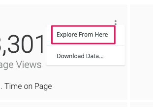
- Hover your mouse over any visualization, and you'll see the three-dot button for that visualization appear in its top right corner:

- Click on the three-dot button to open the options menu, then click on Explore From Here to open Explore:
Open Explore from a report
You can also open Explore from any report:
- Open Uberflip Analytics and view any report.
- Hover your mouse anywhere over the report table, and you'll see additional buttons appear in the top right corner:
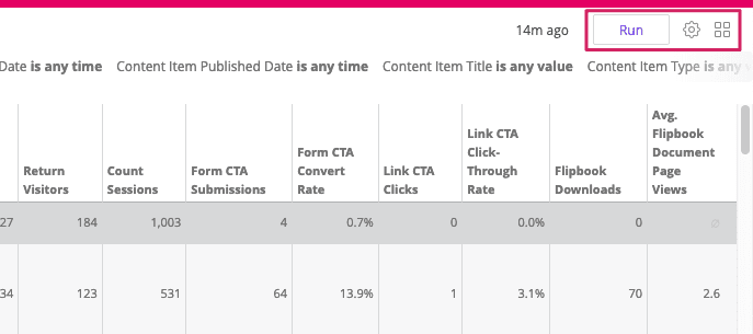
- Click on the gear button to open the options menu, then click on Explore From Here to open Explore:
Overview of the Explore interface
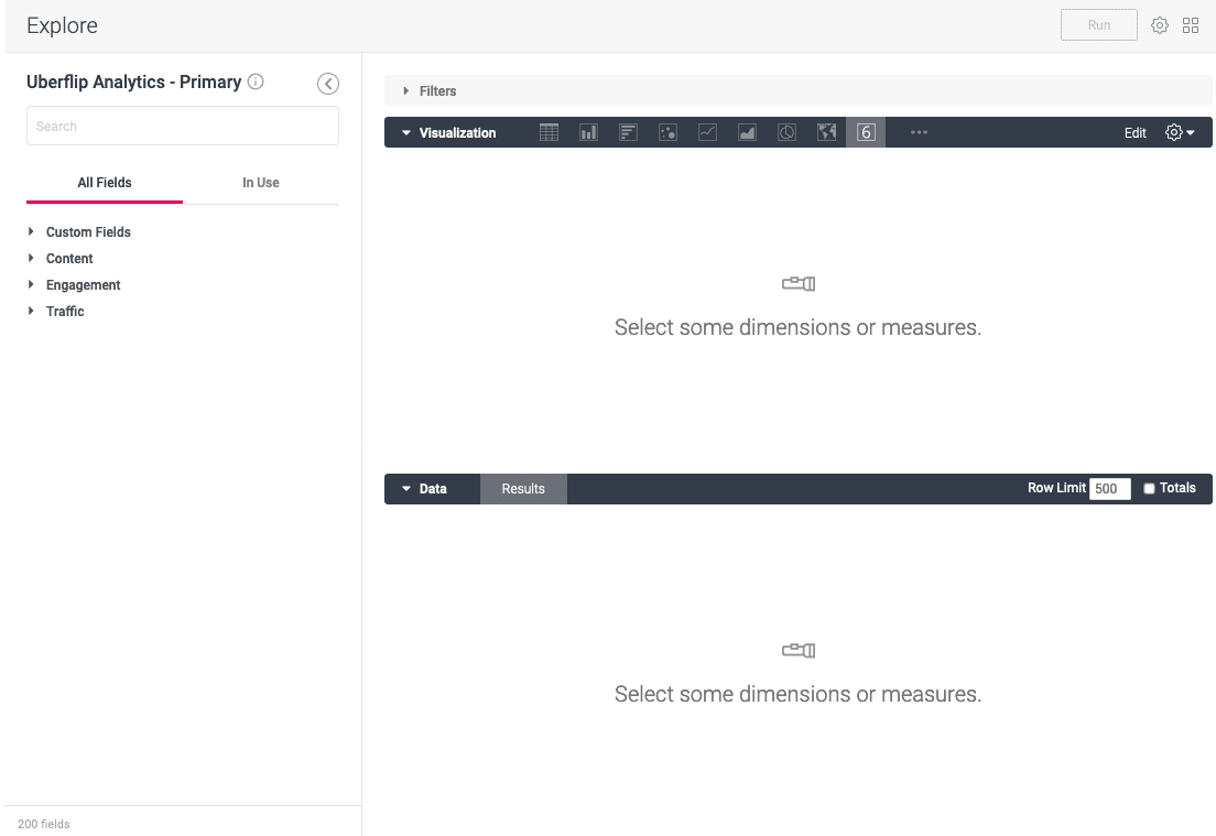
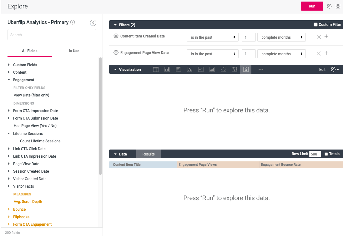
Whenever you open Explore, it'll look something like this:
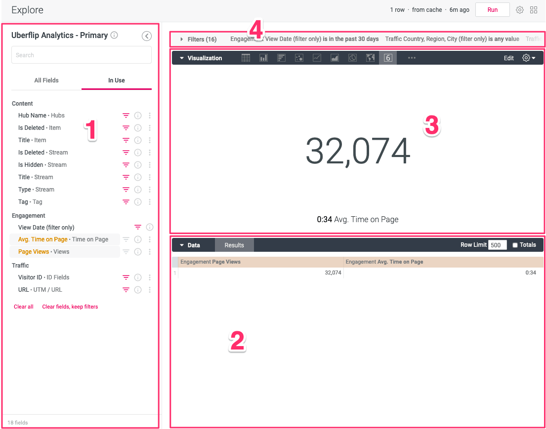
This is the Explore interface. It's divided into four main areas, which are highlighted in the screenshot above:
- Field picker: The sidebar on the left is the field picker. It lists all of the available fields (dimensions and measures) in the Uberflip Analytics data model, divided into the three main data categories. This is where you find and add dimensions and measures to add to your query, or to use as filters.
- Data section: The section near the bottom contains the data table. Dimensions and measures that you have added to your query are displayed here as table columns.
- Visualization section: The section in the middle shows a visualization (such as a chart or diagram) of the data resulting from your query. A default visualization will always be selected automatically based on the data, but you can change this to any other type of visualization that's compatible with the data.
- Filters section: The section at the top allows you to manage and configure your filters. It is collapsed by default, and you can click on it to expand it and view or modify current filters. Note also that you add filters to this section using the field picker, and that the field picker also shows a Filter label next to any dimension/measure that is currently being used as a filter.
Now, let's look at how you can use this interface to create custom reports.
Create a new custom report
This section will walk you through the process of creating your first custom report in Explore from start to finish. Over the next few steps, you'll build an example report that shows how your content is performing based on two performance indicators, page views and bounce rate. You'll then filter the report to narrow it down to only content that was created and had traffic in the past month.
Starting from scratch
When you open Explore, the data, visualization, and filters sections will always be pre-populated based on the dashboard visualization or report you came from. This is useful if you want to start with a particular data set and modify it, for example if you want to add more detail to a stock report.
However, most of the time you'll probably want to create your own custom reports, and in this case it's simplest to start from a clean slate. Thankfully, it's easy to just clear everything away and start from scratch at any time:
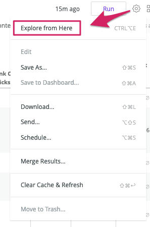
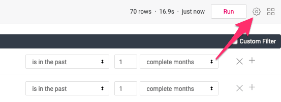
- With Explore open, click on the gear button in the top right corner to open the options menu:

- Click on Remove Fields & Filters:
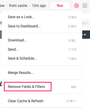
- All previously set dimensions, measures, and filters will be removed, allowing you to start from scratch:
Now that you have a blank canvas to work with, you can get started building your report.
Adding (and removing) dimensions and measures
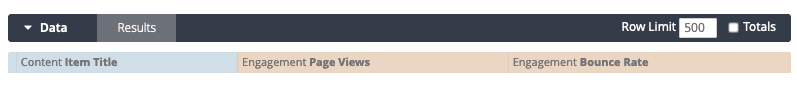
Whenever you build a custom report from scratch, the first step is always to add dimensions and measures to your query using the field picker. For this example report, you'll add one dimension (Item Title), and two measures (Page Views and Bounce Rate):
- Look at the field picker on the left side: it contains a list of all dimensions and measures in the data model, as well as a search box to narrow down that list.
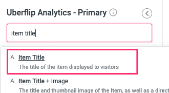
- The first dimension to add is Item Title. Type "item title" into the search box, and a search results box will appear to show matching dimensions and measures:
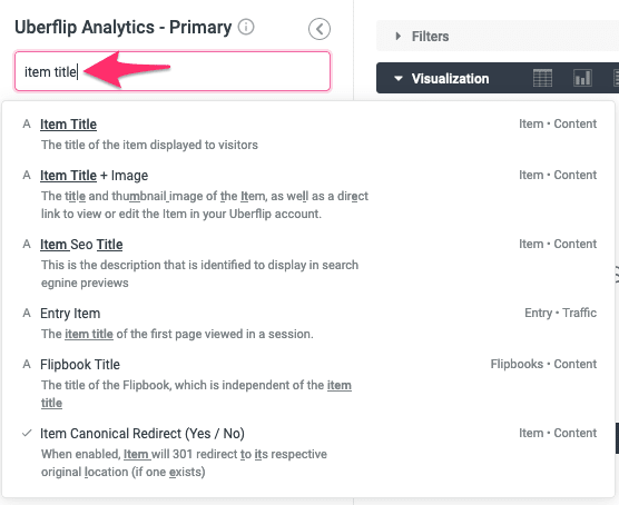
- In the search results, click on Item Title:
- Alternatively, you can also search through the full list of dimensions and measures to find Item Title under Content > Item, then click on Title:
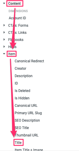
- Alternatively, you can also search through the full list of dimensions and measures to find Item Title under Content > Item, then click on Title:
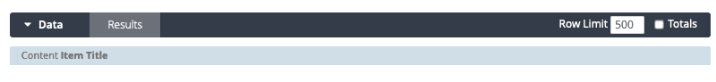
- Notice how "Content Item Title" now appears in the data section of Explore:
- Now, repeat this process to add the measure Page Views:
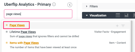
- Notice how measures look orange in the field picker (compared to blue-grey for dimensions), and how this is also reflected in the data section:
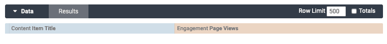
- Repeat the process one more time to add another measure, Bounce Rate. Your data section should now look like this:
- You can also remove any dimension or measure you've added at any time. To do that, just hover your mouse over it in the data section, and a gear button will appear:

- Click on the gear button to open an options menu, then click on Remove:
- The selected dimension/measure will be removed from the data section. If you removed one of the three dimensions/measures you added in the previous steps, don't forget to add it back to your query!
Tip
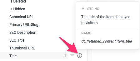
If you want to learn more about a particular dimension or measure, you can read a brief description by hovering your mouse over it in the field picket, then clicking the little i tooltip beside it:
In addition, you can also refer to the Uberflip Analytics data dictionary for more in-depth definitions of all of the dimensions and measures in the data model.
Before you run this query, there's just one more step: adding some filters to narrow down the data.
Setting Filters
Right now, the query you've put together includes all data for the selected dimension and measures, i.e. for all time. For this report you only want data for the last month, so the next step is to set filters to narrow down the data being pulled from the database.
Note that you could press the Run button right now to just pull in all data (in fact, you could do this at any time), but setting filters first will mean that your query loads faster, because Explore doesn't have to waste time pulling data you're not interested in.
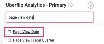
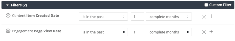
- First, narrow down the data to only content that had a page view in the past month. In the field picker on the left, search for "page view date". In the search results, find Page View Date:
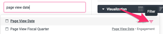
- Remember that clicking on a dimension or measure will add it to the data section. Instead, hover your mouse over Page View Date, and some buttons will appear immediately to the right. Click on the Filter button (three horizontal lines arranged like a pyramid):
- As with adding fields to the data section, you can also do this from the list in the field picker directly. Simply find the dimension or measure to use as a filter, hover your mouse over it, and click on the the same Filter button:
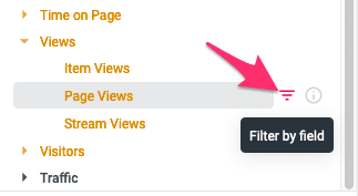
- As with adding fields to the data section, you can also do this from the list in the field picker directly. Simply find the dimension or measure to use as a filter, hover your mouse over it, and click on the the same Filter button:
- The filter section at the top will automatically expand and display the new filter:
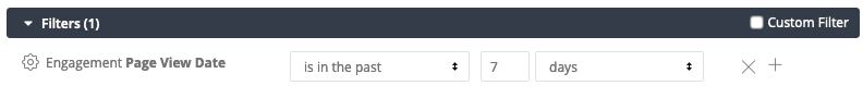
- Use the controls in the filter section to change the filter settings to "is in the past 1 complete months":
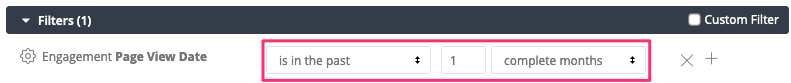
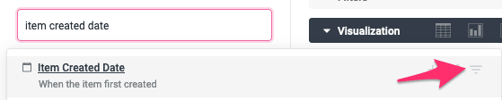
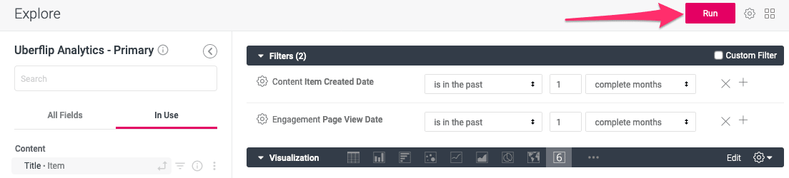
- Next, add another filter for Item Created Date > Date:
- Configure this filter as "is in the past 1 complete months" as well:
Tip
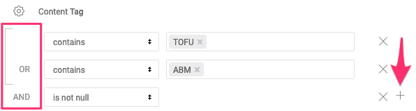
You won't be using this feature for this report, but you can also further refine any filter by adding conditions. To do so, simply click on the + button on the right of the filter. This will add further configurable lines to the filter with either an AND or an OR condition, set automatically based on the filter option you select:
You can learn more about how to use filters in this article from Looker.
Now your query is all ready to go: all that's left to do is to run it and pull in some data.
Running a query
If you've set everything up according to the instructions above, Explore should now look like this:
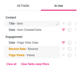
Note also that you can click on the "In Use" tab in the field picker to see an overview of the fields you've added both to your query and as filters:
With your dimensions and measures added and filters set, you're ready to run the query and generate a report.
- To run your query, simply click on the Run button in the top right corner:
- You'll see Loading Data... for a few moments while the query runs and Explore pulls in data. When the process is complete, the data table will populate, and a visualization will appear.
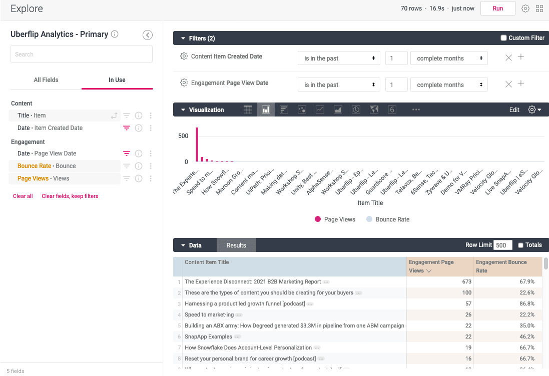
Notice how the colored bars representing the dimensions and measures in the data section are actually table headings: now that the data has been populated, the relevant data for each heading appears in rows below. You can click on a table heading to sort the table, and drag the table headings to reorder them.
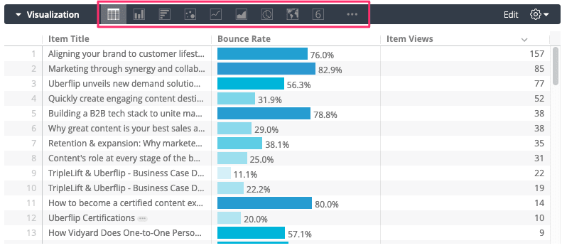
The visualization section will display an auto-selected visualization for the data in the table, based on the type of data. You can toggle between different visualizations using the buttons in the menu bar:
Now, just start digging into the data to see what you can learn. In addition to examining the data in front of you, you can also:
- Add or remove dimensions and measures to change the data that's displayed
- Set, remove or modify filters to further refine your query
- Visualize the data in various ways
- Re-run the query at any time to grab fresh data or to apply data or filter changes
If this is just a one-off query, you can simply exit Explore by navigating away from the page when you're done, and the report will disappear. But if you want, you can also save reports so that you can return to (and run) them again later.
Save, view, and edit custom reports
Save custom reports
Explore has the ability to save your custom reports so that you can pull them up again (with refreshed data, if applicable) at any time. Uberflip Analytics is powered by the Looker business intelligence platform, which uses the term "Looks" for custom reports. Here's how you save a Look:
- At any time, click on the gear button in the top right corner to open the options menu:
- Click on Save as a Look...:

- In the Save Look menu, enter a title (and optionally a description) for your custom report:
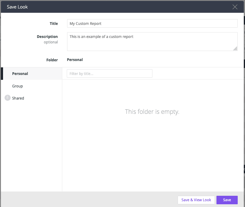
- Under Folder, select the type of folder you'd like to save your custom report in:
- Personal: The Personal folder is only accessible to you, i.e. any reports saved to a user's Personal folder will only be visible to that user.
- Group: The Group folder is accessible to any other user in your organization who holds an Uberflip Analytics View license (i.e. can access Uberflip Analytics).
- Shared: The Shared folder is for experimental reports created by Uberflip, and you can't save custom reports to this folder.
- Finally, click on Save to save the report and return to the Explore interface. Alternatively, if you want to view the Look in the report view (instead of in Explore), click on Save & View Look.
View and edit saved custom reports
Once you have saved a Look, you can open the saved report again at any time, as well as edit the report in Explore.
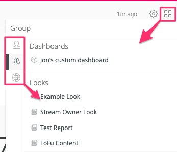
- From anywhere in Uberflip Analytics (you don't need to be in the Explore interface), click on the Browse (four boxes) button in the top right.
- Use the buttons along the side of the menu to select the folder, then click on the name of the Look on the right to open it:
- This will open the Look in the report view. To view and edit it, click on the gear button in the top right, then click on Edit:
- The Look will open in the Explore interface, where you can make any changes you want.
For more in-depth information about managing your Looks, see this documentation from Looker:
Looker: Saving and Editing Looks
Dive deeper into Explore functionality
This introduction to Explore only scratches the surface of what's possible, and there is a lot of additional functionality that we haven't covered.
If you want to become an Explore power user and really get the most out of your Uberflip Analytics data, we encourage you to check out Looker's Explore documentation, which covers all of Explore's advanced features in depth. Here, you can learn how to do things like:
- Pivoting dimensions
- Drilling down into individual data points
- Creating your own dashboards
- Setting advanced and custom filters
- Customizing visualizations
You can find all of the advanced feature documentation for Explore here: